Posts

Showing posts from June, 2018

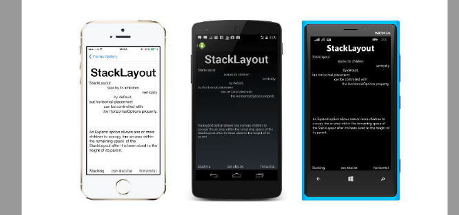
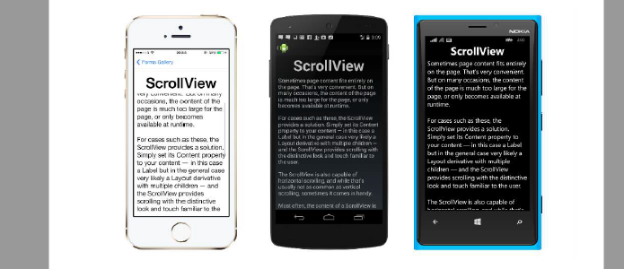
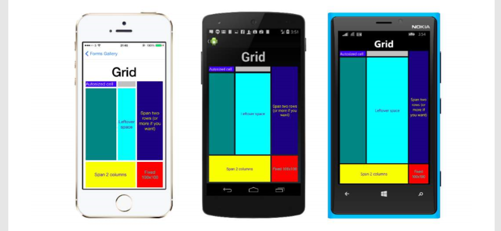
Navigation in Xamarin.Forms

NavigationPage flow with XAML App.xaml.cs file (App.xaml file is default, so skipped) using Xamrin.Forms namespace NavigationApp { public partial class App : Application { public static INavigation GlobalNavigation { get; private set; } public App() { InitializeComponent(); var rootPage = new NavigationPage(new FirstPage()); GlobalNavigation = rootPage.Navigation; MainPage = rootPage; } } } FirstPage.xaml file <?xml version="1.0" encoding="UTF-8"?> <ContentPage xmlns="http://xamarin.com/schemas/2014/forms" xmlns:x="http://schemas.microsoft.com/winfx/2009/xaml" x:Class="NavigationApp.FirstPage" Title="First page"> <ContentPage.Content> <StackLayout> <Label Text="This is the first page" /> <Button Text="Click to navigate to a new page" Clicked="GoToSecondPageButtonClicked"/> <Button Text="Click to open the new page

Relative Layout in xamarin forms

Image
                                                  ( Box after box ) public class MyPage : ContentPage { RelativeLayout _layout; BoxView centerBox; BoxView rightBox; BoxView leftBox; BoxView topBox; BoxView bottomBox; const int spacing = 10; const int boxSize = 50; public MyPage() { _layout = new RelativeLayout(); centerBox = new BoxView { BackgroundColor = Color.Black }; rightBox = new BoxView { BackgroundColor = Color.Blue, //You can both set width and hight here //Or when adding the control to the layout WidthRequest = boxSize, HeightRequest = boxSize }; leftBox = new BoxView { BackgroundColor = Color.Yellow, WidthRequest = boxSize, HeightRequest = boxSize }; topBox = new BoxView { BackgroundColor = Color.Green, WidthRequest = boxSize, HeightRequest = boxSize }; bottomBox = new BoxView { BackgroundColor = Color.Red, WidthRequest = boxSize, HeightRequest = boxSize }; //First adding center box since other boxes will be relative to cen

StackLayout in xamarin forms

Image
StackLayout organizes views in a one-dimensional line ("stack"), either horizontally or vertically. Views in a StackLayout can be sized based on the space in the layout using layout options. Positioning is determined by the order views were added to the layout and the layout options of the views. Usage in XAML :  <StackLayout> <Label Text="This will be on top" /> <Button Text="This will be on the bottom" /> </StackLayout> Usage in code : StackLayout stackLayout = new StackLayout { Spacing = 0, VerticalOptions = LayoutOptions.FillAndExpand, Children = { new Label { Text = "StackLayout", HorizontalOptions = LayoutOptions.Start }, new Label { Text = "stacks its children", HorizontalOptions = LayoutOptions.Center }, new Label { Text = "vertically", HorizontalOptions = LayoutOptions.End }, new Label { Text = "by default,", HorizontalOptions = LayoutOptio

TemplatedView & Frame & RelativeLayout in xamarin forms

Image
TemplatedView : An element that displays content with a control template, and the base class for ContentView. Frame : An element containing a single child, with some framing options. Frame have a default Xamarin.Forms.Layout.Padding of 20.and you can make radius corner XAML <Frame> <Label Text="I've been framed!" HorizontalOptions="Center" VerticalOptions="Center" /> </Frame> Code var frameView = new Frame { Content = new Label { Text = "I've been framed!", HorizontalOptions = LayoutOptions.Center, VerticalOptions = LayoutOptions.Center }, OutlineColor = Color.Red }; RelativeLayout : A Layout that uses Constraints to layout its children. RelativeLayout is used to position and size views relative to properties of the layout or sibling views. Unlike AbsoluteLayout, RelativeLayout does not have the concept of the moving anchor and does not have facilities for position

ScrollView in xamarin forms

Image
An element capable of scrolling if it's Content requires. ScrollView contains layouts and enables them to scroll offscreen. ScrollView is also used to allow views to automatically move to the visible portion of the screen when the keyboard is showing. Note: ScrollViews should not be nested. In addition, ScrollViews should not be nested with other controls that provide scrolling, like ListView and WebView. A ScrollView is easy to define. In XAML: <ContentPage.Content> <ScrollView> <StackLayout> <BoxView BackgroundColor="Red" HeightRequest="600" WidthRequest="150" /> <Entry /> </StackLayout> </ScrollView> </ContentPage.Content> The same definition in code: var scroll = new ScrollView(); Content = scroll; var stack = new StackLayout(); stack.Children.Add(new BoxView { BackgroundColor = Color.Red, HeightRequest = 600, WidthRequest = 600 });

ContentPresenter and ContentView in xamarin forms

Image
ContentPresenter : A layout manager for templated views. Used within a ControlTemplate to mark where the content to be presented appears. ContentView : An element with a single content. ContentView has very little use of its own. Its purpose is to serve as a base class for user-defined compound views. * XAML <ContentView> <Label Text="Hi, I'm a simple Label inside of a simple ContentView" HorizontalOptions="Center" VerticalOptions="Center"/> </ContentView> * Code var contentView = new ContentView { Content = new Label { Text = "Hi, I'm a simple Label inside of a simple ContentView", HorizontalOptions = LayoutOptions.Center, VerticalOptions = LayoutOptions.Center } };

Grid Layout in Xamarin Forms

Image
A layout containing views arranged in rows and columns. This is a typical Grid definition in XAML. <Grid>  <Grid.RowDefinitions>   <RowDefinition Height="2*" />    <RowDefinition Height="*" />   <RowDefinition Height="200" />  </Grid.RowDefinitions>  <Grid.ColumnDefinitions>   <ColumnDefinition Width="Auto" />    <ColumnDefinition Width="*" />  </Grid.ColumnDefinitions>     <ContentView Grid.Row="0" Grid.Column="0"/>   <ContentView Grid.Row="1" Grid.Column="0"/>  <ContentView Grid.Row="2" Grid.Column="0"/>   <ContentView Grid.Row="0" Grid.Column="1"/>  <ContentView Grid.Row="1" Grid.Column="1"/>  <ContentView Grid.Row="2" Grid.Column="1"/> </Grid> The same Grid defined in code looks like this

AbsoluteLayout in Xamarin Forms

Image
AbsoluteLayout positions and sizes child elements proportional to its own size and position  or by absolute values. Child views may be positioned and sized using proportional values or  static values, and proportional and static values can be mixed. A definition of an AbsoluteLayout in XAML looks like this: <AbsoluteLayout>     <Label Text="I'm centered on iPhone 4 but no other device"        AbsoluteLayout.LayoutBounds="115,150,100,100" LineBreakMode="WordWrap"  />     <Label Text="I'm bottom center on every device."        AbsoluteLayout.LayoutBounds=".5,1,.5,.1" AbsoluteLayout.LayoutFlags="All"        LineBreakMode="WordWrap"  />     <BoxView Color="Olive"  AbsoluteLayout.LayoutBounds="1,.5, 25, 100"        AbsoluteLayout.LayoutFlags="PositionProportional" />     <BoxView Color="Red" AbsoluteLayout.LayoutBounds="0,.5