Grid Layout in Xamarin Forms
A layout containing views arranged in rows and columns.
This is a typical Grid definition in XAML.
<Grid>
<Grid.RowDefinitions>
<RowDefinition Height="2*" />
<RowDefinition Height="*" />
<RowDefinition Height="200" />
</Grid.RowDefinitions>
<Grid.ColumnDefinitions>
<ColumnDefinition Width="Auto" />
<ColumnDefinition Width="*" />
</Grid.ColumnDefinitions>
<ContentView Grid.Row="0" Grid.Column="0"/>
<ContentView Grid.Row="1" Grid.Column="0"/>
<ContentView Grid.Row="2" Grid.Column="0"/>
<ContentView Grid.Row="0" Grid.Column="1"/>
<ContentView Grid.Row="1" Grid.Column="1"/>
<ContentView Grid.Row="2" Grid.Column="1"/>
</Grid>
The same Grid defined in code looks like this:
var grid = new Grid();
grid.RowDefinitions.Add (new RowDefinition { Height = new GridLength(2, GridUnitType.Star) });
grid.RowDefinitions.Add (new RowDefinition { Height = new GridLength (1, GridUnitType.Star) });
grid.RowDefinitions.Add (new RowDefinition { Height = new GridLength(200)});
grid.ColumnDefinitions.Add (new ColumnDefinition{ Width = new GridLength (200) });
To add items to the grid: In XAML:
<Grid>
<--DEFINITIONS...--!>
<ContentView Grid.Row="0" Grid.Column="0"/>
<ContentView Grid.Row="1" Grid.Column="0"/>
<ContentView Grid.Row="2" Grid.Column="0"/>
<ContentView Grid.Row="0" Grid.Column="1"/>
<ContentView Grid.Row="1" Grid.Column="1"/>
<ContentView Grid.Row="2" Grid.Column="1"/>
</Grid>
In C# code:
var grid = new Grid();
//DEFINITIONS...
var topLeft = new Label { Text = "Top Left" };
var topRight = new Label { Text = "Top Right" };
var bottomLeft = new Label { Text = "Bottom Left" };
var bottomRight = new Label { Text = "Bottom Right" };
grid.Children.Add(topLeft, 0, 0);
grid.Children.Add(topRight, 0, 1);
grid.Children.Add(bottomLeft, 1, 0);
grid.Children.Add(bottomRight, 1, 1);
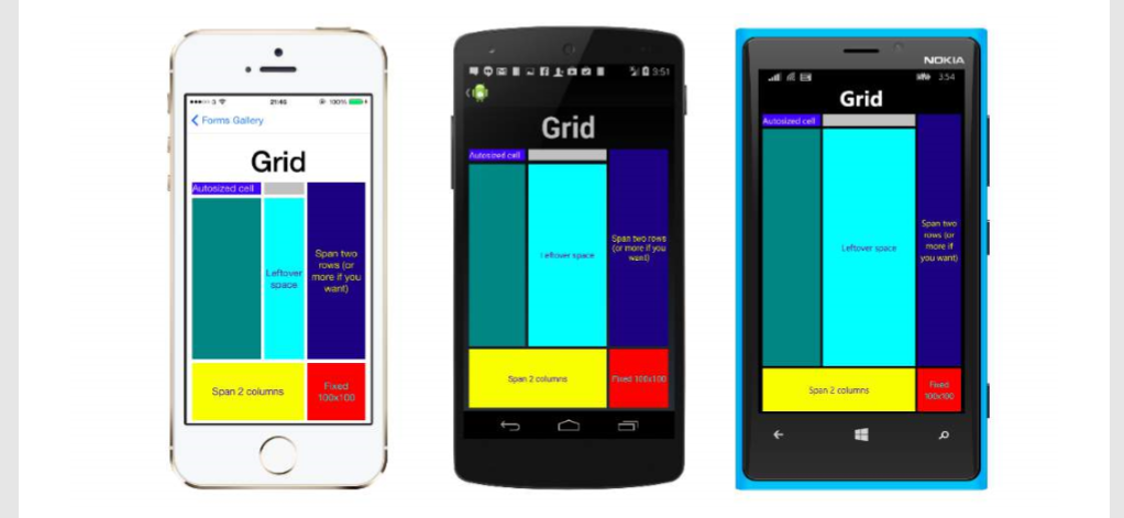
For Height and Width a number of units are available.
- Auto – automatically sizes to fit content in the row or column. Specified as GridUnitType.Auto in C# or as Auto in XAML.
- Proportional – sizes columns and rows as a proportion of the remaining space. Specified as a value and GridUnitType.Star in C# and as #* in XAML, with # being your desired value.Specifying one row/column with * will cause it to fill the available space.
- Absolute – sizes columns and rows with specific, fixed height and width values.Specified as a value and GridUnitType.Absolute in C# and as # in XAML, with # being your desired value.
Note: The width values for columns are set as Auto by default in Xamarin.Forms, which means that the width is determined from the size of the children. Note that this differs from the implementation of XAML on Microsoft platforms, where the default width is *, which will fill the available space.

Comments
Post a Comment